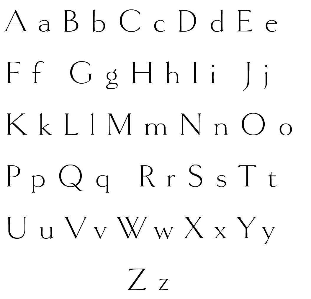
Hudson Font- Digital Calligraphy
Hudson is based on the logotype of a literary magazine from the late 1920s. It’s an art deco take on the classic Roman letterforms, kind of an art deco Trajan, but with lowercase. With its fine features, it is best used large.


NOTES:
- Case sensitivity for Hudson font: both uppercases and lowercases are available.
- Please double check the spelling of your guest's names, as we simply copy and paste your names. The correct spelling is your responsibility.
- ALL cards printed custom & bespoke to order. NO RETURNS unless error on our part.
"This morning the doorbell rang and it was a box from Mr. P’s. This is the most beautiful and thoughtful presentation I have ever seen. I am giddy and love it all. You made my day! Thank you!!!"
— Regina B.
★★★★★
"Your personal touched will solidify your success with Mr. P’s. Bravo!! Very special to get a handwritten note!I Wish you all the success and will continue to support you!"
— Jill F.
★★★★★
"My heartfelt thanks for providing such lovely products in our over-processed, mass produced world."
— Dorothy T.
★★★★★
Why We're Different
Since 2018, The Punctilious Mr. P's Place Card Co. has distinguished itself by redefining the art of tablescaping with a blend of Southern charm and Chinoiserie chic. Our collections are more than just paper stationery; they are curated experiences that transform entertaining into a celebration of belonging and joy— allowing everyone a literal and figurative 'seat at the table.' Each product is a testament to tradition reimagined for the modern world, emphasizing inclusivity over antiquated formality.
It is your embrace of our vision that inspires us to continue creating places of connection and celebration. For this, we are grateful to you.